Introduction
Welcome to the documentation for our HTML templates. Whether you're a beginner or experienced developer, this guide covers everything you need to build and customize your website with ease.
Dive in and start creating something amazing!
Resources and credits:
This template is fully coded and built on top of Open Sources, more details here:
- Bootstrap : Open-source front-end framework.
- Popper.js : This is an excellent library for handling poppers.
- AOS : Animate on scroll library.
- Prism : A lightweight, extensible syntax highlighter (We used it to improve the visual appearance of the documentation).
- Glide : A lightweight, flexible, and fast JavaScript ES6 slider and carousel. Built for sliding.
- GLightbox : A touchable pure Javascript lightbox with mobile and video support.
- Typed : A JavaScript typing animation library.
Images:
Our template includes high-quality images from Unsplash, Pexels, and Pixabay. When needed, we use AI to create unique visuals. All images are included to inspire and enhance your projects.
How to Change Images in the Template:
There are two common ways to use and replace images in this template: with an <img> tag or via CSS background style.
Steps (for both methods):
- Find your new image (on your computer).
- Rename it (optional) to match the old file name for easy replacement.
-
Upload it to the same folder (e.g.,
/assets/img/or/assets/logo/). -
Update the HTML:
A. Using
<img>tag:B. Using background style:
- Save and refresh your browser to see the update.
Icons:
Through most of the examples in this template, we are using
Bootstrap Icon
and
Heroicons
.
So, all you need to do is to add icons using the <svg> tag directly to your HTML code. Here's an example:
And sometimes, we used other icons in the SVG format from these icons libraries:
Lucide Icons
,
Google Icons
,
Tabler Icons
,
Fontawesome Icons
.
Quick start
To start using this template you will need to import some files in your current project or start from scratch using our template (scroll down in this page to view it).
Note: By default all of these quick starts are configured on the template, so don't worry!
Tooling setup:
CSS
Copy and paste the following <link> tags into your <head>, before all other stylesheets, to load our CSS:
JavaScript
Some components require Bootstrap’s JavaScript to function properly. Include the following <script> tags just before the closing </body> tag. Popper.js is already included in bootstrap.bundle.min.js.
Bootstrap starter template
Use the HTML5 doctype and viewport meta tag to follow modern design and responsive standards. Your page should look like this:
Important globals:
This template includes key global styles to ensure consistent behavior across browsers.
HTML5 doctype
Bootstrap needs the HTML5 doctype to work properly; without it, styles may break.
Please add dir="ltr" to the html tag
it is important for some styles like arrows ... etc!!!
Responsive meta tag
Bootstrap uses a mobile-first approach. Add the viewport meta tag in your <head> for proper scaling and touch support.
Bootstrap Documentation
If you want to learn more, we recommend you check the Bootstrap documentation, click here for the documentation
RTL: Right to Left Laguages
RTL means Right to Left laguages like Arabic and Hebrew.
Learn how to enable support for right-to-left text in our template:
There are two strict requirements for enabling RTL in Bootstrap-powered pages.
-
Set
dir="rtl"on the<html>element. -
Add an appropriate
langattribute, likelang="ar", on the<html>element.
From there, you’ll need to include an RTL version of our CSS (main.min.rtl.css). Example:
Color Modes (Light, Dark, and Auto Mode Toggle)
This template has a top-right toggle for light, dark, and auto modes. In auto mode, it follows the user's device settings.
Note: The toggler initially defers to a user’s current system color mode but provides an option to override that and pick a specific color mode.
Enabling the Toggle
To enable the light, dark, and auto mode toggle, you need to include the color-modes.js file at the top of your HTML document, just after the opening <head> tag (By default it is included!):
Bootstrap Documentation
For details on customizing light and dark modes, including Sass variables and the data-bs-theme attribute, see the official Bootstrap documentation.
Compiling SCSS and Managing Dependencies
Prerequisites: For smooth SCSS compilation, use the latest Node.js LTS version. It ensures a stable and reliable development environment. Follow these steps to effectively compile Bootstrap SCSS and manage dependencies:
1. Navigate to the SCSS Folder
Start by locating the target SCSS folder within your project directory. This is where the SCSS files, including those for Bootstrap, are stored.
2. Install Dependencies and devDependencies
Once Node.js is installed, open your terminal and execute the following command to install the required dependencies:
This command will fetch and install the dependencies outlined in your project's package.json file.
3. Make Desired Changes
Feel free to make any necessary changes to your SCSS files. This could involve adjusting Bootstrap variables, customizing styles, or adding your own stylesheets.
4. Compile to Minified CSS
To compile your SCSS files, including Bootstrap's SCSS, into a minified CSS file, execute the following command:
This command compiles and outputs a minified main.min.css file to assets/css/.
5. Compile To Unminified CSS
If you prefer to compile the SCSS files without minification, use the following command:
This command compiles and outputs an unminified main.css file to assets/css/.
6. Example: Changing the Website’s Color Scheme Using SCSS
To change the site’s color scheme, edit _color_palette.scss in assets/scss/ — you’ll find primary, text, and background color variables at the end.
Note: Customize colors by editing SCSS variables.
Use uicolors.app/create to generate shades (50–950) and match your brand.
7. Generating RTL CSS File
First install the rtlcss package, by executing the following command:
(You can learn more on this guide: rtlcss.com)
To create a right-to-left (RTL) version of your main.min.css for languages that read from right to left, execute the following command at the same folder that locate main.min.css file:
Running this command will transform your main.min.css into main.min.rtl.css, which can be used to support RTL languages.
Colors
Use color utility classes to convey meaning and style elements, including hover effects. The primary palette is neutral and used throughout the template.
1 - Background colors:
.bg-body-secondary
.bg-body-tertiary
2 - Text colors:
.text-primary
.text-primary-emphasis
.text-secondary
.text-secondary-emphasis
.text-success
.text-success-emphasis
.text-danger
.text-danger-emphasis
.text-warning
.text-warning-emphasis
.text-info
.text-info-emphasis
.text-light
.text-light-emphasis
.text-dark
.text-dark-emphasis
.text-body
.text-body-emphasis
.text-body-secondary
.text-body-tertiary
.text-black
.text-white
Changing the Font Family
If you'd like to customize the font-family used throughout the template, it's a straightforward process. By following these steps, you can easily modify the font-family to better match your design preferences.
Step 1: Locate the style.css File
First, locate style.css in ./assets/css/. It's included on all pages.
Step 2: Identify the Font Import
At the top of style.css, you’ll see an @import rule for the current font. Example:
Step 3: Change the Font Family
To change the font, find the font-family in the CSS (usually under body) and replace 'Inter var' with your preferred font—local or imported.
Step 4: Save Your Changes
After editing font-family, save style.css. The new font will apply site-wide for consistent styling.
Utilities (Our Custom SCSS)
Bootstrap has a lot of utility/helper classes to quickly style elements without using any CSS code. See the official Bootstrap documentation. We also made some changes to the SCSS, including spacing (margins, padding), sizing (max-width, max-height, width, height), and more to better fit the design.
Reminder:
The following utilities are part of our custom SCSS, not the default Bootstrap.
To view all modifications in full, check the main.css file (The unminified version).
Spacing Utilities
We’ve customized Bootstrap’s spacing utilities in our own SCSS. This includes changes to spacing values (margin, padding, gap, and gutters) to better fit the design system.
Example: Margin
Use directional classes like .mt-*, .mb-*, .ms-*, .me-*, .mx-*, .my-* for specific sides. They are responsive too (e.g., mt-sm-4).
For negative margins, add n before the value (e.g., .mt-n1 → margin-top: -0.25rem).
Note:
This spacing scale and naming pattern also apply to padding, gap, and gutters. All follow the same step-based values and support responsive classes like pt-sm-10 or g-sm-5:
-
Padding (
.p-*,.pt-*,.pb-*, etc.), with an extended range up to.p-12(12rem) -
Gap and gutters (
.gap-*,.gx-*,.gy-*,.g-*, etc.)
Sizing: Max-Width & Max-Height
Use these utilities to set the maximum width or height of an element. The max-height utilities follow the same pattern as max-width.
Example: Max-Width
Sizing: Width & Height
These utilities are for setting the width or height of an element. The .h-* classes for height follow the same sizing pattern as the .w-* classes for width.
Example: Width
Borders: Border Radius
Use the .rounded-* utilities to control the border-radius of an element. These classes are also responsive, like .rounded-sm-6.
-
All Sides: Use
.rounded,.rounded-0,.rounded-1, etc., to apply the radius to all corners. -
Specific Sides: Target specific sides with
-top,-end,-bottom, and-start. -
Shapes: Use
.rounded-circlefor a perfect circle and.rounded-pillfor a pill shape.
Example: rounded
Effects: text-shadow
Utilities for controlling the shadow of a text element. These classes work seamlessly in both light and dark modes, automatically adapting to your theme:
Example:
An optimized Workflow.
An optimized Workflow.
An optimized Workflow.
An optimized Workflow.
An optimized Workflow.
An optimized Workflow.
Effects: mask-image
To apply mask effects, start with the base .mask-image class to enable masking capabilities. Combine it with directional modifiers and percentage controls, plus responsive disable utilities when needed:
-
Base class:
.mask-image(required for all mask effects) -
Direction modifiers:
-
.mask-top(top fade) -
.mask-bottom(bottom fade) -
.mask-start(start - auto-flips for RTL/LTR) -
.mask-end(end - auto-flips for RTL/LTR)
-
-
Percentage controls:
-
.mask-{direction}-from-{0,10,25,50,75,90,100}(fade from position) -
.mask-{direction}-to-{0,10,25,50,75,90,100}(fade to position)
-
-
Responsive Disabling:
-
.mask-none-{xs,sm,md,lg,xl,xxl}(disables mask for specific breakpoint ranges)
-
Example:

Typography (Our Custom SCSS)
Refine your text with our versatile typography classes. Easily customize font-size, line-height, letter-spacing, and text clamping to ensure your content looks great on all devices.
Reminder:
The following typography classes are part of our custom SCSS, not the default Bootstrap.
To view all modifications in full, check the main.css file (The unminified version).
Font Size
Utilities for controlling the font size of an element.
Line Height
Utilities for controlling the leading (line-height) of an element.
Letter Spacing
Utilities for controlling the tracking (letter-spacing) of an element.
Line Clamp
Utilities for clamping text to a specific number of lines.
Contact Form Configuration (PHP)
Now, let's discuss setting up the contact form so that you can receive messages by adding your email.
1 - PHP Configuration
To receive messages from the contact form, you'll need to update the email address in the email.php file, which is located in the ./assets/php directory. Simply replace "Your_Email@example.com" with your own email address.
Note: Be sure to check your spam or junk folder if you don't see the email in your inbox.
2 - JavaScript Functionality
Make sure you have the ./assets/js/scripts.js javascript file at the bottom of the page. (By default it is included!)
Subscribers Form Configuration (Mailchimp)
This section will guide you through getting the action URL from a Mailchimp embedded form. This URL is all you need to connect the template's subscriber form to your Mailchimp account, allowing you to easily collect email subscribers.
Heads up:
Mailchimp's interface may change, but the goal is the same: find and copy the action attribute.
Here's what you need to do:
- Log in to your Mailchimp account and navigate to the audience dashboard.
-
Select the audience for which you want to create the embedded form:
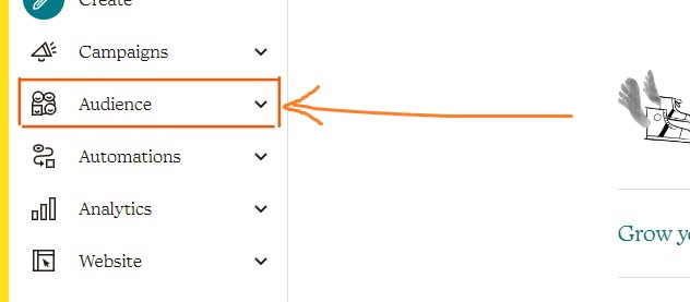
-
Click on the
Signup Formstab:
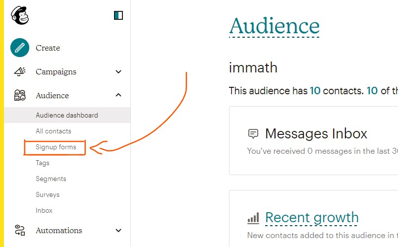
-
Click on the
Create embedded form:
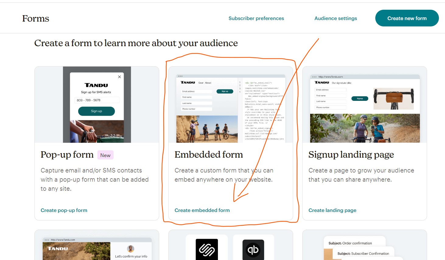
-
Fill out the inputs:
Embedded form nameand select theAudience, then clickBeginbutton.
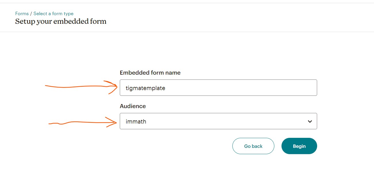
-
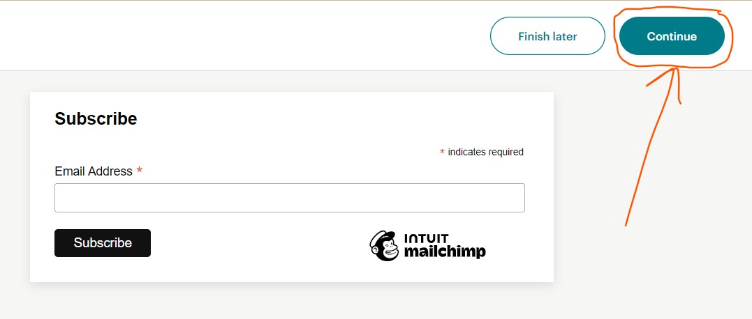
Click on the
Continuebutton:
-
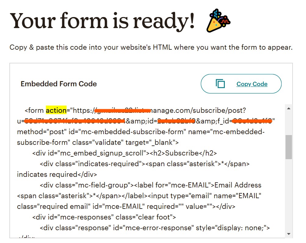
You should see a code snippet that begins with
<form action="...".
Copy only the URL part of theactionattribute and remove the quotation marks around it, as shown on this screen:
-
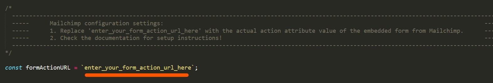
In the
assets/js/scripts.jsfile, find theformActionURLconstant, which is typically defined at the beginning of the file:
-
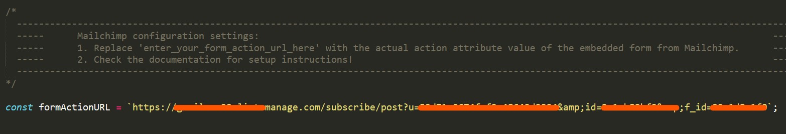
Next, replace
enter_your_form_action_url_herewith the URL you copied from Mailchimp and save the file.
-
And don't forget to include
scripts.jsat the bottom of your page, (by default it is included!):
You should now have a fully functional subscribers form with only the action URL copied.
Alerts
Provide contextual feedback messages for typical user actions with the handful of available and flexible alert messages.
Examples with icons:
Operation Successful
Registration is complete! Welcome to our vibrant community. You can now access all the features and resources we offer.
Critical Error Encountered
Database connection has failed! This issue requires urgent attention to restore services and prevent data loss.
Proceed with Caution
Low disk space detected! Free up space to avoid performance issues and ensure your system runs smoothly.
Informational Update
System maintenance is scheduled for 3 AM. Please plan your activities accordingly to avoid disruptions.
Primary Notification
A new feature update is available! Discover the latest enhancements and improve your user experience today.
Supplementary Alert
Backup completed successfully! Your data is safe and secure. Regular backups help protect against data loss.
Heads-Up Notice
You have received a new message! Check your inbox to stay updated with the latest information.
Urgent Security Concern
A security breach has been detected! Immediate action is required to secure your account and protect your data.
Algolia Search
Algolia is a powerful search-as-a-service platform with a REST API for indexing and searching data. It is an excellent solution for enhancing your static site with robust search functionality.
To get started, you'll need three pieces of information from Algolia:
- Application ID: This is a unique identifier for your application.
- Search API Key: This key is used to search the index.
- Index Name: The name of the index you've created (Usually, this is the name of the JSON file you uploaded!).
Important Consideration:
The Algolia platform may change. Regardless of any design updates, your main goal is to get the three required pieces of information.
Algolia Setup
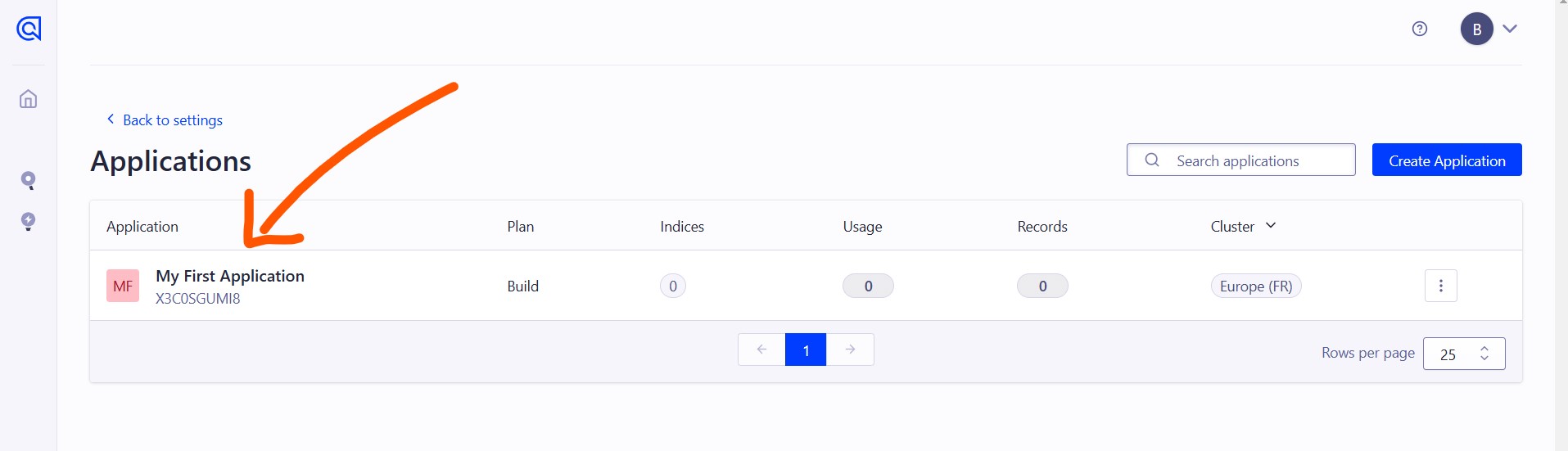
Creating an Account and an Application: If you haven't done so already, create an account with Algolia.
When you create an account for the first time, a default application named My First Application is automatically created for you. You can use this application instead of creating a new one. Or if you want, you can create a new application by using this link: create an application.
Populating the Index
To enable search functionality, we need to populate the index with data. For now, we will use the Algolia UI to do this.
Here’s how to do it using the Algolia UI:
When you click on My First Application, you'll see something like the following screenshot, and then click on the upload a file card.
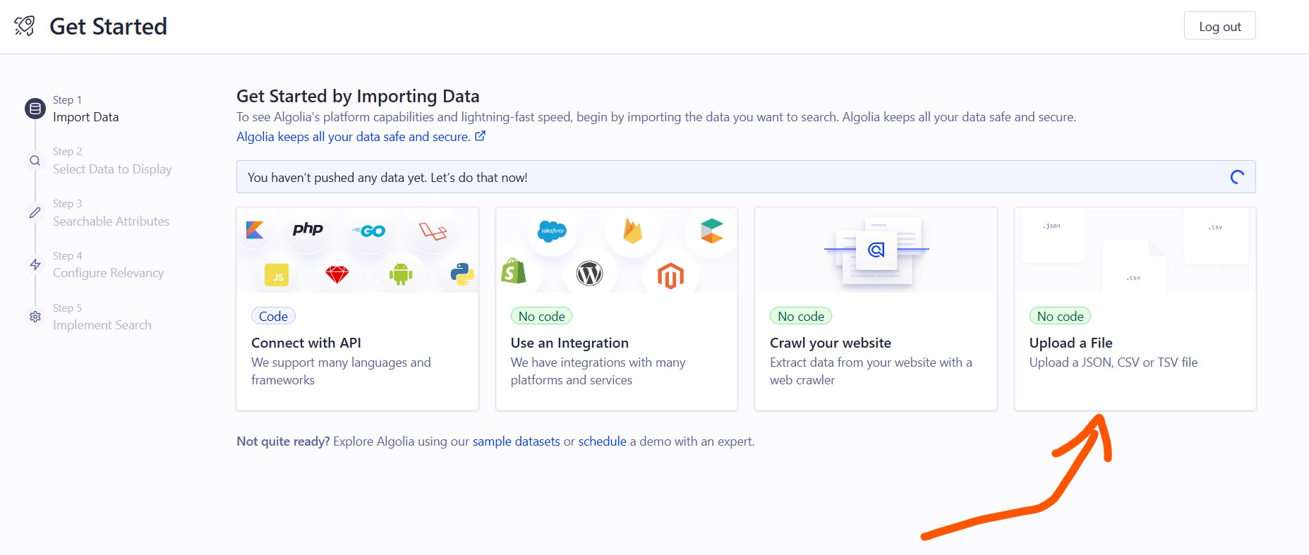
Then, a pop-up window will appear, where you need to upload the JSON file.
The JSON file is located at assets/img/algolia/algolia-json.json. Open it with your favorite text editor, such as Sublime Text or VS Code. Make the necessary changes to fit your website content, and then upload the updated file.
Alternatively, you can copy this example and create a new file:
Image Replacement and Optimization Guide
Note: Remember to replace the images in the same folder assets/img/algolia/ with your own images. Also, make sure they are smaller in size. These images are the ones displayed in front of the search results when you perform searches.
When the file uploaded, then choose title for the primary text field and description for the secondary text field. As shown on this example:
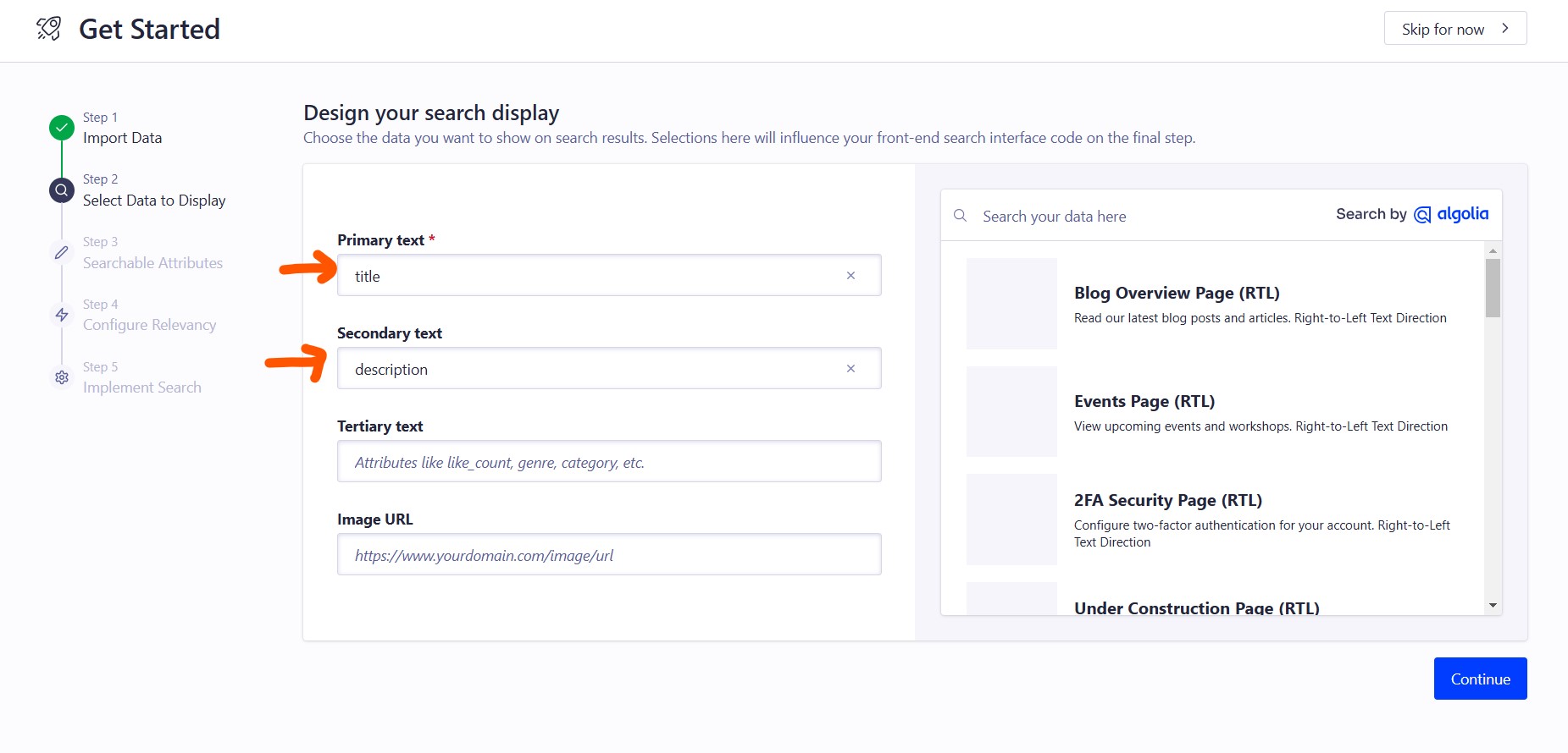
And then click the Continue button three times. Then copy the Application ID and Search API Key
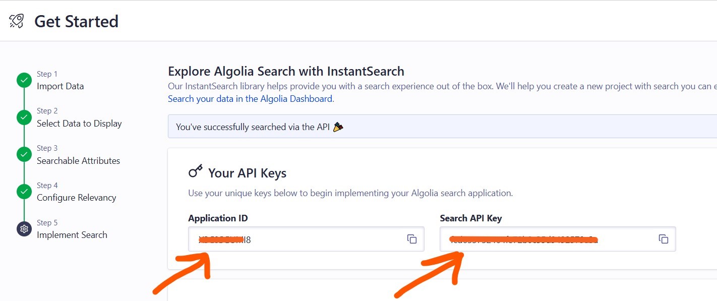
Once you have this information from the Algolia platform, paste these values into the variables located at the top of the scripts.js file found in the assets/js/ directory (by default the file is included!), like this:
Algolia Index Name Reference
Note: The ALGOLIA_INDEX_NAME is usually the name of the JSON file you uploaded. Alternatively, you can find it somewhere in the Algolia dashboard!
Including the Search Button for Algolia
To enable the search functionality with Algolia and trigger the search modal, ensure you include the following button code in your HTML file. This button, when clicked, will open the search modal, allowing users to perform searches using Algolia. This code is included in the file by default:
Note:
Ensure you have the following files in these folders:
-
assets/libraries/algolia/algoliasearch-lite.umd.js -
assets/libraries/algolia/instantsearch.production.min.js
We have included a script located in assets/js/scripts.js. This script dynamically includes the above files and creates the search modal. To enable this functionality, simply include the scripts.js file at the bottom of your HTML file.
Here’s how you can include the scripts.js file: (by default the file is included!)
CSS Modification:
We've added some CSS to modify its style. It is located on the assets/css/style.css. (by default it is included!)
Additionally, you can learn more about setting up Algolia search in this blog post.
Animation: AOS
AOS: CSS-Driven “On Scroll” Animation Library.
How AOS Works
AOS animates elements on scroll by adding or removing the aos-animate class based on their position. All visual animation is controlled entirely by CSS.
- Check this example for the Demo
- This is the source code at GitHub Source Code
- To get a better understanding how this actually works, I encourage you to check the post on CSS-tricks.
Here are some examples of how you can use it:
And you need to include some packages: (They are included by default!)
CSS Package:
JS Package:
This is how we initialize it:
This is initialized by default at the file scripts.js located a the folder path: assets/js/
Countdown Timer
This section provides a step-by-step guide for editing a countdown timer on an HTML page. By following the instructions, you can easily update the launch date and time of your countdown. Let's dive in!
- Open the HTML file containing the countdown in your preferred text editor.
-
Look for the line of code that sets the
data-future-dateattribute. It should look something like this: -
Change the
dateandtimeto your desired launch date and time,while making sure to maintain the exact format. For example:Please use the short forms for the months like this:- January: Jan
- February: Feb
- March: Mar
- April: Apr
- May: May
- June: Jun
- July: Jul
- August: Aug
- September: Sep
- October: Oct
- November: Nov
- December: Dec
-
And don't forget to include
scripts.jsat the bottom of your page, (by default it is included!):
- Save the changes you modified from the HTML file.
- Open the HTML file in your web browser to confirm that the countdown has been updated to reflect the new launch date and time.
And that's it! You've successfully edited the countdown on your HTML page.
Google Maps
To embed a Google Map on a webpage, you can use the Google Maps Embed API. Here's how:
- Go to the Google Maps website and search for the location you want to display on the map.
-
Click on the
Share or embed mapbutton and then click on theembed maptab. -
Customize the size and appearance of the map using the options provided, then click on the
copy HTMLbutton to copy the embed code. - Paste the embed code into the HTML of your webpage. The map will now be displayed on your webpage and will be interactive for your visitors.
-
Note:
To ensure the map matches the template's design, you should only update the
srcattribute in the example code below. Copy the URL from the code provided by Google Maps and paste it into thesrcattribute, keeping all other attributes likeclassandstylethe same.
Example:
Typed
Typed.js is a library that types. Enter in any string, and watch it type at the speed you’ve set, backspace what it’s typed, and begin a new sentence for however many strings you’ve set. Live Demo
The README on GitHub is going to be very helpful for any questions, features, or use cases.
Text animation example:
Unlock the power of
Input example:
And you need to include a JS package at the bottom: (It's included by default!)
For Javascript, we have added the script to make it work on scripts.js file. So include the file at the bottom (by default it is included!) or use this code:
Note:
If you want to include multiple Typed.js instances on the same page, ensure each instance uses unique IDs, like typed2 and typed-strings2, to avoid conflicts. Use the appropriate function (initializeTyped or initializeTypedInput) to reinitialize the JavaScript code with the corresponding unique IDs. This guarantees that each Typed instance operates independently, allowing for multiple animations without interference. Adjust the initialization options according to your specific requirements for each instance.
tsParticles
To add particles to the background of a webpage, you can use a library such as
tsParticles.js.
-
Include the following
tsparticles.bundle.min.jsnear the end of your page, right before the closing</body>tag, to enable them. (by default it is included!) -
Create a
divelement in your HTML page where you want the particles to be displayed. Give thedivelement anIDso you can reference it in your JavaScript code. For example: -
Include the JavaScript function to your HTML page that initializes the particles. The function should use the
tsParticles.jslibrary to create a new particle effect and display it in thedivelement you created earlier.
The JavaScript function is located in thescripts.jsfile. (by default it is included!)Note: it should be included aftertsparticles.bundle.min.js!
Particles Options
If you want only to make some changes:
- Go to tsParticles.JS Demo / Generator. Edit whatever you need from the panel on the left side.
-
After you're happy with the settings, click on
Moredropdown at the top left corner. -
And then click on
Export Config. Scroll to the bottom and then click theCopybutton. -
Open the
scripts.jsfile in your text editor, and search for theoptionTsParticlesobject and then changed it to the new data that you copied before.
Here is a portion of the JavaScript code: (by default it is included!)
Note:
You can find more information about tsParticles on this
Github Repository
CSS Modification:
We've added some CSS to modify its style. It is located on the assets/css/style.css. (by default it is included!)
Add Another Particle Container:
To add another particle container, create another div with a different id (e.g., tsparticles2) and load it using tsParticles.load with the new options or the same option as before.
Filters
Use the .filter class to apply CSS filter effects to an element. Supported filters include
blur,
brightness,
contrast,
drop-shadow,
grayscale, and
saturation.
Reminder:
The following classes are part of our custom SCSS, not the default Bootstrap.
To view all modifications in full, check the main.css file (The unminified version).
Note: To disable the filter, use the .filter-none class or .filter-none-hover on hover to disable the filter effects.
To apply the filter effects , use the .filter class to define the desired effects. You can then combine it with one or more of the following classes like: .filter .blur-3xl .brightness-105 .grayscale-100
1 - Blur:
Example:
2 - Brightness:
Example:
3 - Contrast:
Example:
4 - Drop Shadow:
Note:
This is useful for applying shadows to irregular shapes, like text and SVG elements. For applying shadows to regular elements, you should probably use a box-shadow instead like .shadow-sm, .shadow, and .shadow-lg classes.
Example:
5 - Grayscale:
Example:
6 - Saturate:
Example:
Backdrop Filters
Use the .backdrop-filter class to apply visual effects to the content behind an element. This allows you to create layered, frosted-glass effects without altering the CSS directly.
The supported backdrop filter effects is only blur.
Reminder:
The following classes are part of our custom SCSS, not the default Bootstrap.
To view all modifications in full, check the main.css file (The unminified version).
Note: To disable the backdrop filter, use the .backdrop-filter-none class or .backdrop-filter-none-hover on hover to disable the backdrop-filter effects.
To apply the backdrop filter effects , use the .backdrop-filter class to define the desired effects. You can then combine it with the following classes like: .backdrop-filter .backdrop-blur-xl
Backdrop Blur:
Example:
Transitions & Animation
Enhance your website's visual dynamics with classes for smooth transitions and animations. These utilities allow you to easily define how elements transition, manage timing functions, and apply various effects to improve the user experience.
Reminder:
The following classes are part of our custom SCSS, not the default Bootstrap.
To view all modifications in full, check the main.css file (The unminified version).
Transition Property:
Utilities for controlling which CSS properties transition..
Example:
Transition Duration:
Example:
Transition Timing Function:
Example:
Transition Delay:
Example:
Transforms:
Our Transform CSS classes provide a powerful way to apply visual effects like translation, rotation, and scaling. They leverage CSS variables for easy customization and are fully compatible with both LTR and RTL layouts.
Reminder:
The following classes are part of our custom SCSS, not the default Bootstrap.
To view all modifications in full, check the main.css file (The unminified version).
Note: To disable all transformations, use the .transform-none class or .transform-none-hover class on hover.
To apply the transform , use the .transform class to define the base class. You can then combine it with the following classes like: .transform .scale-150-hover
1 - Scale:
Example:
2 - Rotate:
Example:
Note:
1 -
Use the .rotate-n{*} , and .rotate-n{*}-hover classes for negative values
2 -
Use the .rotate-x-{*} , .rotate-y-{*} , and .rotate-z-{*} for x, y, and z axes. You can use the same logic for negative values and hover states for x, y, and z axes as we did for .rotate-{*} classes.
3 - Translate:
Example:
Note:
Use the
.translate-x-n{*} , .translate-x-n{*}-hover ,
.translate-y-n{*} , .translate-y-n{*}-hover ,
.translate-z-n{*} , and .translate-z-n{*}-hover
classes for negative values
4 - Skew:
Example:
Note:
Use the
.skew-y-n{*} , .skew-y-n{*}-hover ,
.skew-x-n{*} , and .skew-x-n{*}-hover
classes for negative values
5 - Transform Origin:
Utilities for specifying the origin for an element's transformations.
Example:
6 - Perspective & Perspective Origin:
Perspective: Utilities for controlling an element's perspective when placed in 3D space.
Perspective Origin: Utilities for controlling an element's perspective origin when placed in 3D space.
Example:
perspective-origin-top-start
perspective-origin-bottom-end